
Micro-Font Quilt
Search for a bitmap font
As I was pondering what image to use as my banner on this site, I was seeing All Well workshop's latest quilting project slowly unfold on social media. It's an alphabet quilt they're making in preparation of a riso-print zine with patterns for all of the letters. The construction is intricate, with diagonal lines and half-squares when required to make the letters readable, but the final appearance is still charmingly blocky.
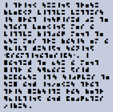
I think seeing those blocky little letters is what inspired me to start looking for a little bitmap font to use for the basis of a quilt design saying "Craftinatorics". I wanted to use a font with a square grid because it's simpler to sew and invokes that this website has both quilting and computer vibes.
So I took a little tour of some tiny bitmap fonts. The criteria for my search was first and foremost that I needed that bitmap to be tiny. Craftinatorics has an absolutely awful number of letters. This is what I get for choosing a name that's a portmanteau of mathematical jargon!
My second criteria was that the font I choose still have some amount of visual flair. When bitmap fonts get very small, they tend to look very similar to one another. Because this is art for a banner, it does not necessarily need to prioritize readability over fun.
Here are some of the fonts I considered:
(in no particular order)
I rendered each font at the same resolution, so you can see the relative sizes of each.


After my search, I found this trove of other bitmap fonts
BitFont Maker 2 search for "tiny".
The narrowest are 3 pixels, so nothing as small as
Serge's Tiny 2x3
I decided to go with Serge Zaitsev's Tiny 2x3. I am motivated by its bizarre almost-readable charm and my desire to have to sew the fewest squares possible. The article linked does not specify a license, but I emailed the creator, who said it was fine to use and modify the font with the "most permissive license you could imagine". I think that'll be perfectly fine for my needs!
I turned this font into an actual font file so that I could more easily play around with it. I used BitFont Maker 2 to output a .ttf. Download link will be provided eventually.
Another aspect of this font that motivated me to use it was the basis its design has in information theory. As described in the article, Serge was trying to do a sort of glyph data compression that optimized for the size of the letters and the readability of the most common letters.
To represent a letter --one of 26 options, or 27 counting the space-- as something in binary, we need five binary digits. That actually gives us 32 possible options. Those five binary digits correspond to pixels being 'on' or 'off' in the bitmap letter. Five will not work as a number of pixels though, unless we were willing to have our letters be 1x5. That would be very tall and hard to read. So we bump the number up to an even six in order to get a letter grid of 2x3. Now, there are 64 possible ways we could draw a letter. We have some flexibility to be creative.
How many 2x3 fonts?
How many alphabets could you possibly come up with with such a small pixel count? Now is the time when I am very glad that my website name is Craftinatorics, and I hope that I was paying good enough attention in my college-level counting class. First, what am I actually going to count? What are the constraints I'm going to put on the problem?
I am going to count all possible alphabets where:
- Letters are 2x3 pixels that can only be black or white.
- An alphabet is made up of 26 letters: the English alphabet but case insensitive, no punctuation, and no diacritics.
- Space is still present, and the "letter" with all white pixels is reserved for it.
- It matters which letters are drawn with which set of pixels: if I draw my A like Serge's B and my B like Serge's A and keep the rest the same, that counts as an entirely new alphabet.
- Letters that only have black in one column of the 2x3 grid are treated as identical to their counterpart that's the exact same letter shifted over by one pixel. This is to make kerning these letters possible, and to avoid letters that look identical out of the context of a word.
We start with two to the six, or 64 possible individual glyphs. The special character Space gets one of these glyphs (the blank one), so there are now 63 left for the rest of the alphabet.
There are also the letters identical to their shifted-over counterparts, like Serge's L. We need to remove one of each of these letter pairs. There are two to the three, or 8 of these pairs, but one of those is either the Space or the other one of the pair that we already counted. Either way, we don't need to count it. We subtract 7 from 63 to get 56 valid glyphs at our disposal.
Now we need to know which of these 56 glyphs will be assigned to which of the 26 letters. This is 56 factorial divided by (56-26) factorial, if I remember correctly. In other words, it's 56 * 55 * 54 * ... * 33 * 32 * 31. We can't just do 56 choose 26 because we care about the order of the letters in the alphabet. I need to work this out on paper with a smaller example before I will be confident that I am correct. I have not done this yet, so don't quote me on this, but my preliminary result is 2.7 times 10 to the 42 possible alphabets. How exciting!
English Paper Piecing
EPP (English Paper Piecing) is a form of sewing a quilt top where the fabric is wrapped around tiny pieces of paper before the paper-fabric units are hand-sewn together. After this is complete, the paper can be removed and the quilting process (sewing the quilt top to the batting and quilt back) can begin.
The paper helps create precise points that would normally be a pain to sew together using traditional means. In particular, Y-seams, where three seams meet at a single point, are a breeze in EPP. Because of this advantage, the technique is most famous for designs with tesselations hexagons or diamonds.
Another advantage of EPP is that it makes it easy to piece together very small bits of fabric accurately. Because of this, it's a popular to save small scraps and make an ecclectic quilt with samplings of many different fabrics.
It is beginner-friendly due to its easy to obtain supplies and built-in lack of sewing machine requirement. With traditional piecing it can be hard to line up seams, which is frustrating when you have a design in mind ahead of time. However the prep of basting the fabric to the paper can also delay gratification. Start with a small project to minimize the pain of prepping.
I chose to do EPP for this piece because it's the technique I feel most confident using for the one-inch squares I wanted to use. I am using a variety of fabrics for the letters. Some are scraps from old projects, some are from the local quilt guild's community stash, and some are from my own stash of fabric. See if you can spot any fabrics from the Gallery!
When finished, my quilt will be 43 inches wide and 5 inches tall. I may add some decoration to the top and bottom of the design to add some height, but I'm not worrying about that until I've completed the letters. It will be a wall hanging: I think I'll hang it up by my desk.
Progress
 I have made some great progress so far. Two letters, A and F, are completed.